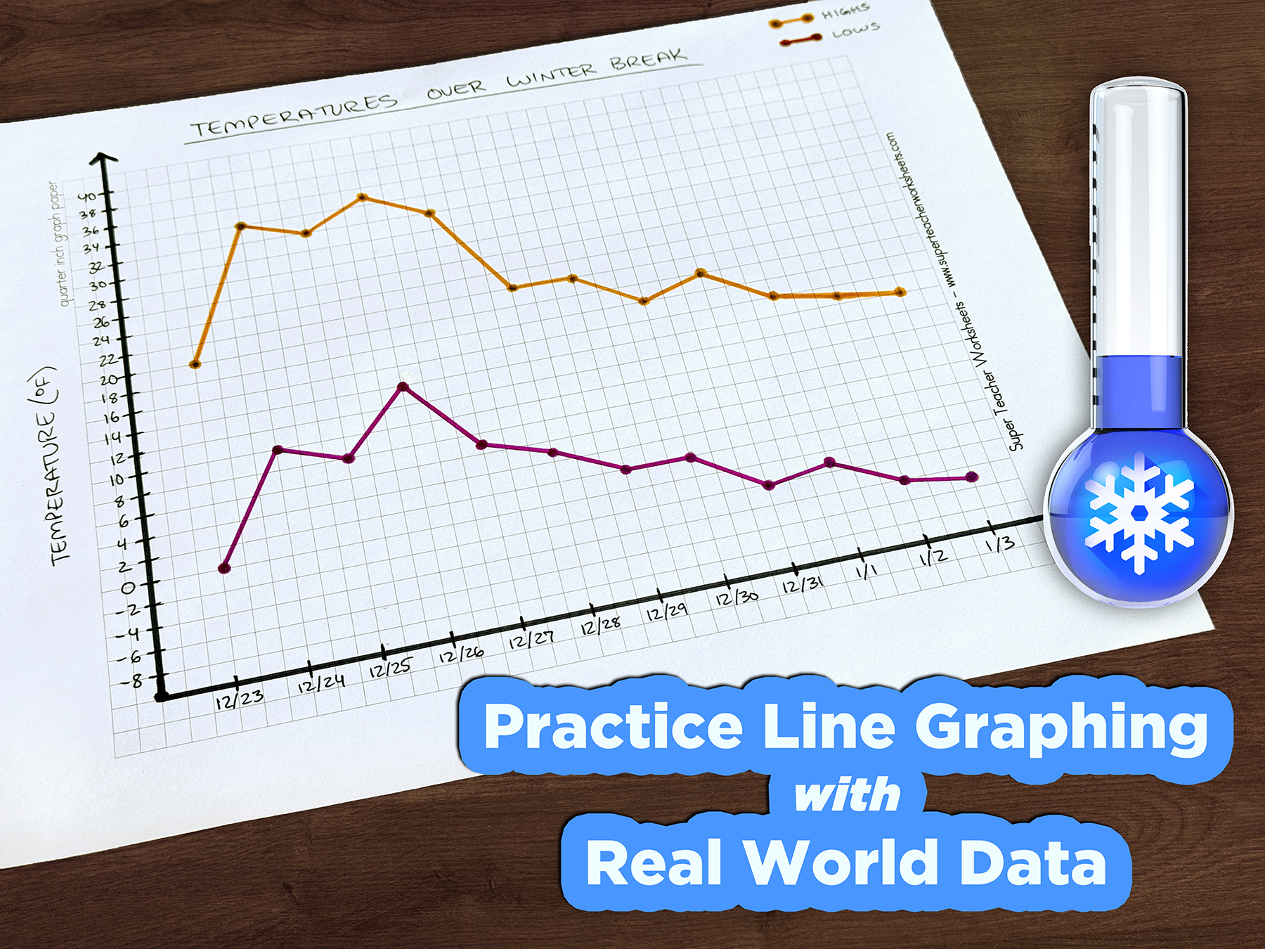
Young learners are exposed to all kinds of graphs in math class: bar graphs, histograms, dot plots, scatter plots, and more! Winter vacation is a great opportunity to engage them with a real-life example of the application of line graphing.
All you’ll need is a sheet of lined paper, a sheet of graph paper, a pencil, and a thermometer or alternate way to check temperatures, such as a smartphone or the weather channel.
Colored pencils or crayons, straightedges, and calculators are all optional, although calculators are strongly recommended if you’re reviewing any advanced skills at the end of the activity.
Step 1: Gather Data
Before starting, pick the date range for your temperature-tracking journey. For schools with one or more winter break, this is the perfect way to keep students’ math brains active.
You and your learners might be eager to start graphing right away, but it’s best to wait until after all data points have been collected to ensure your graph’s y-axis range doesn’t need to change. Instead, use a 3-T chart to track the high and low temperatures each day.
(Note: this versatile activity isn’t limited to vacation! It can be done daily over a whole month, or even all in one sitting by consulting past weather records.)
Step 2: Set Up Your Graph
Use the graph paper to set up a line graph. Connect a horizontal and vertical line to be your axes.
On the x-axis (horizontal), mark each date on a separate line. Temperatures will go on the y-axis (vertical). Use your collected data from step 1 to pick an appropriate range and scale. Your axis can start at any relevant number, including a negative number.
Step 3: Graph Your Data
Once your axes are labeled, you can plot your data points. Each date should have both a high and low temperature point plotted.
Once the points are plotted, draw a line to connect the first date’s high temperature data point to the second date’s high temperature data point, then the second date’s to the third date’s, and so on. Then do the same with the low temperature data points. If you have colored pencils or straightedges, now is the time to use them to make sure lines are straight and visually distinct. Don’t feel limited to the typical “red is hot, blue is cold” colors if your young artist has a different vision!
For a fun science tie-in, if your area’s temperatures hover around freezing (32°F, 0°C), consider drawing a horizontal line across the graph to clearly show when temperatures are above or below it.
Step 4: Explore Trends
Now that you have a hand-drawn mathematical aid, kids can discuss temperatures with actual data! Was the temperature mostly stable the whole time? Did the highs slightly increase or decrease overall? What about the lows? Was the difference between high and low the same every day? Was any day an outlier?
For older students, now is also the time to break out the calculators and explore concepts like range, median, mode, and average. Review the concepts and the methods for determining them, then apply them to the temperature data. Add up the total high temperatures and divide by the total number of days to get the average high temperature for the time period. Sort the temperatures in order from lowest to highest and find the median highs and lows. Are any temperatures repeated enough to stand out as a mode? Don’t forget the possible influence of negatives on temperature range!
—-----------------------------------------------
Tracking real-world data in real time is a great way to keep kids interested in math, whether in school or over a school break. However, this activity doesn’t need to stop when vacation ends! Consider making temperature line graphs for each season. That way your students can also compare data trends over time.
The Super Teacher Worksheets collection of line graph resources can help reinforce skills too.